The Problem
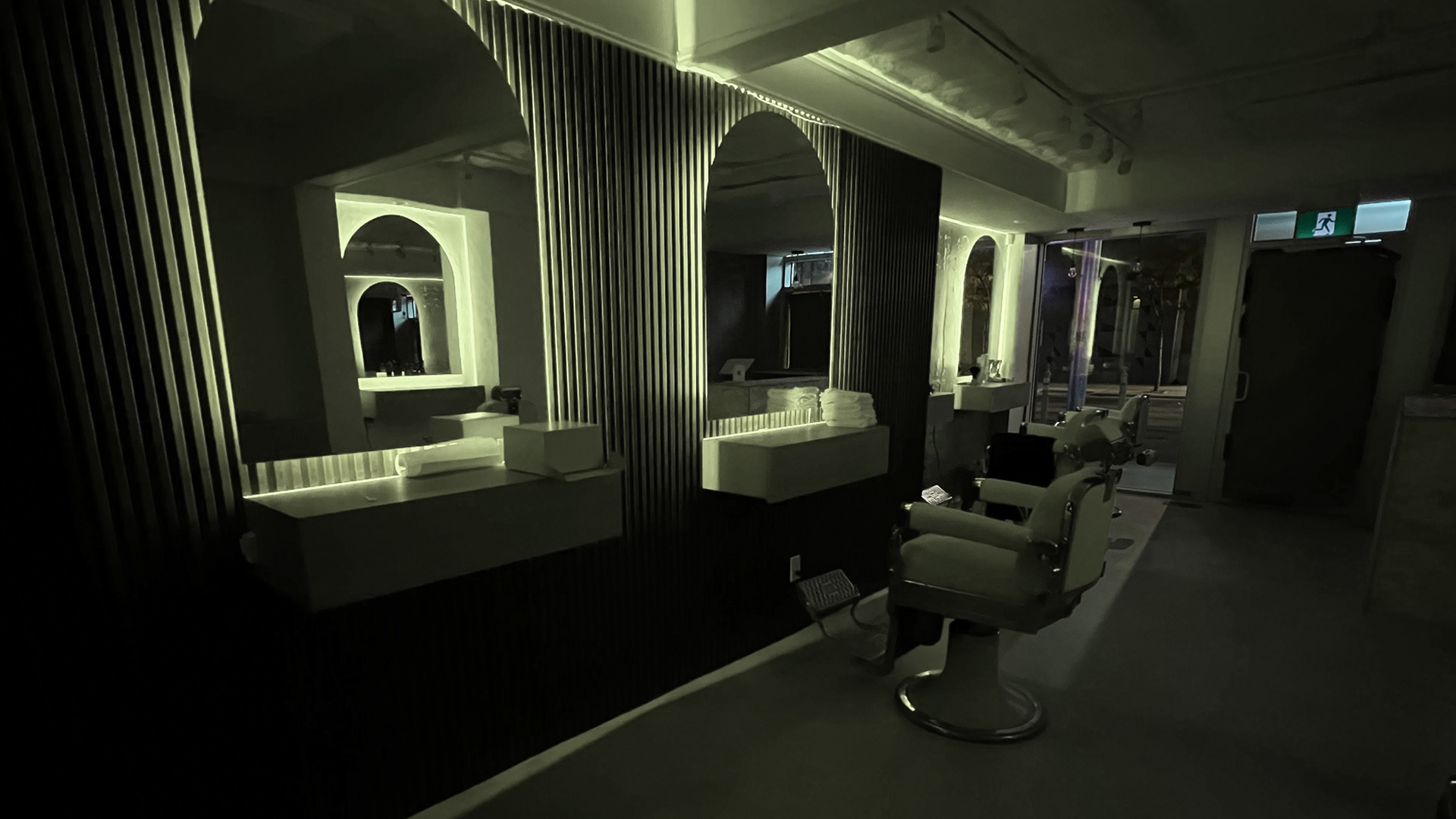
This small-business owner reached out after seeing previous work and being referred. They desperately needed a brand designed before their grand opening in Downtown Toronto, Ontario. Over the call, I could sense the urgency in the owner's voice, when he told me that he needs a brand designed within one week! He wanted a strong brand and logo to create a memorable experience, building around the pillars of being an urban, upscale barber and coffee shop on Toronto's busy Queen Street West. The brand must support the high-end interior design that was being installed. After meeting with the owner, the words used to inspire the upcoming brand identity were modern, Greek-villa vibes, with a touch of Toronto's urban spirit. The goal was to portray a modern brand perception that matched the beautiful interior.
The new brand identity must support the mood and tone of voice used throughout all channels including stationary print, social media, and website while creating a personality in the store.
The Process
The process started with an initial discovery session with the owner. By asking them what they see for their brand, its future, and the keywords used to describe its personality, an excellent perspective on the brand's direction, was gained. From this meeting, the foundation of the brand was created.
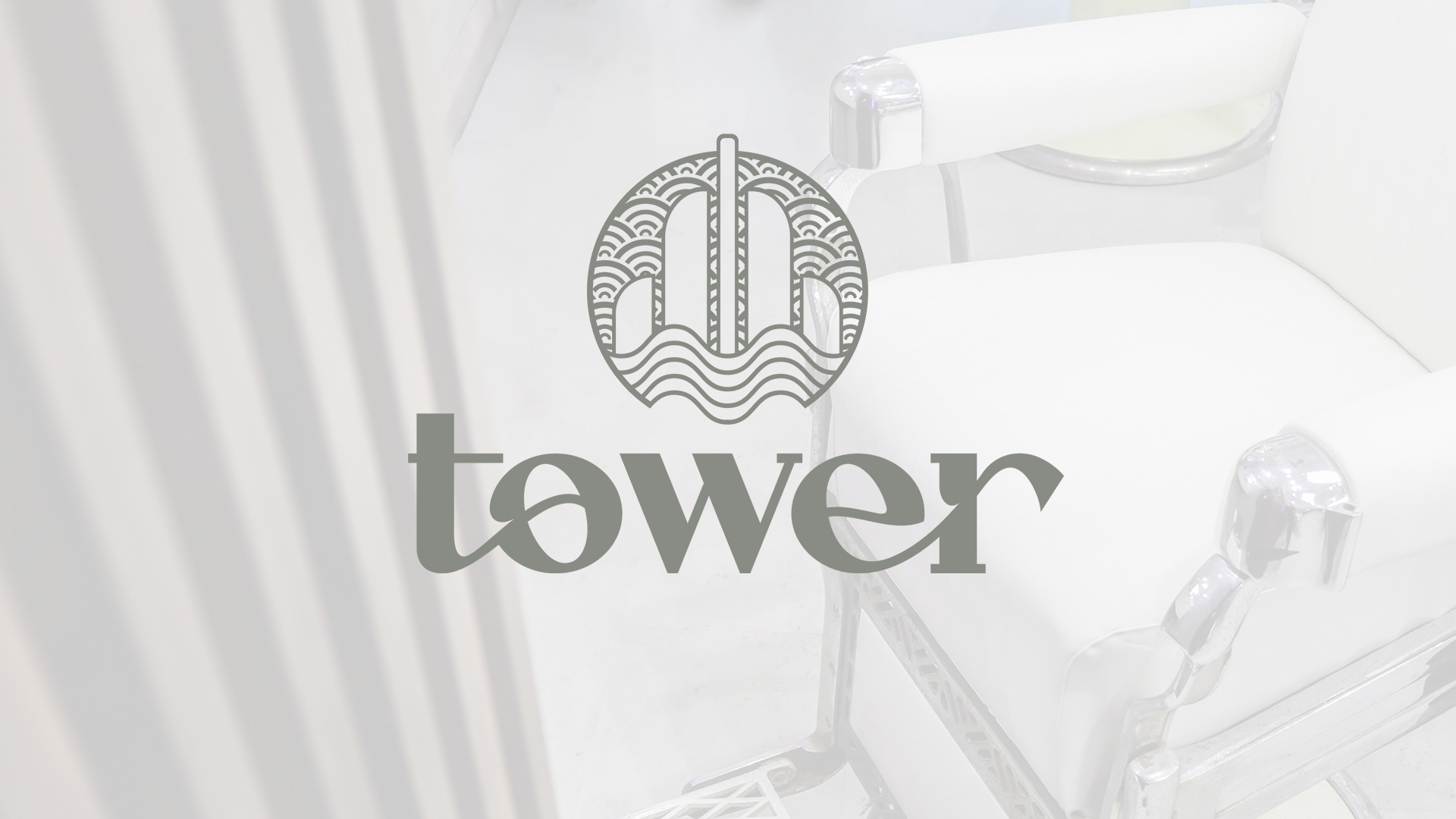
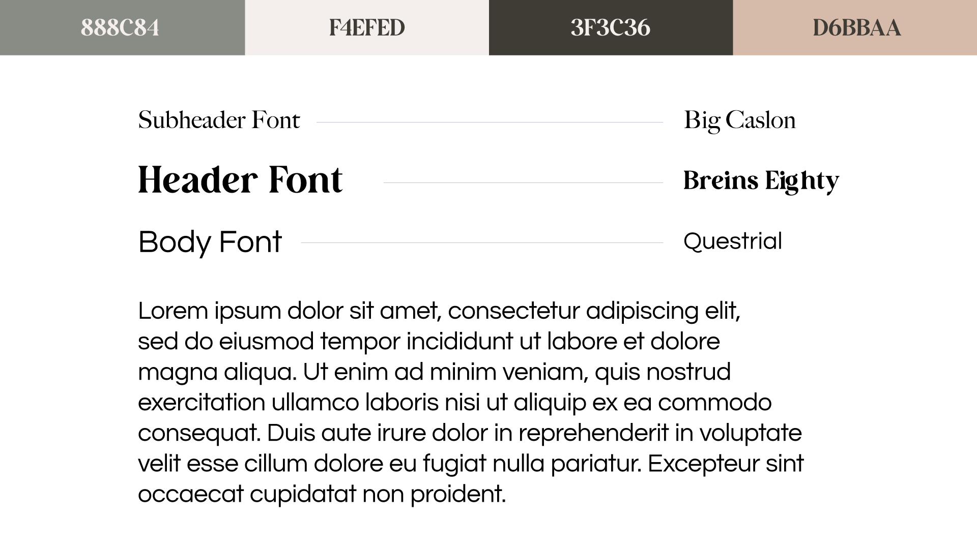
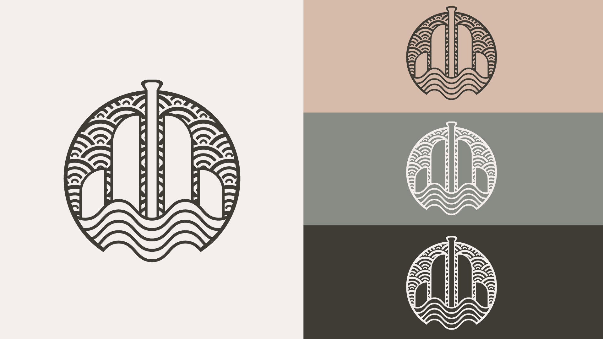
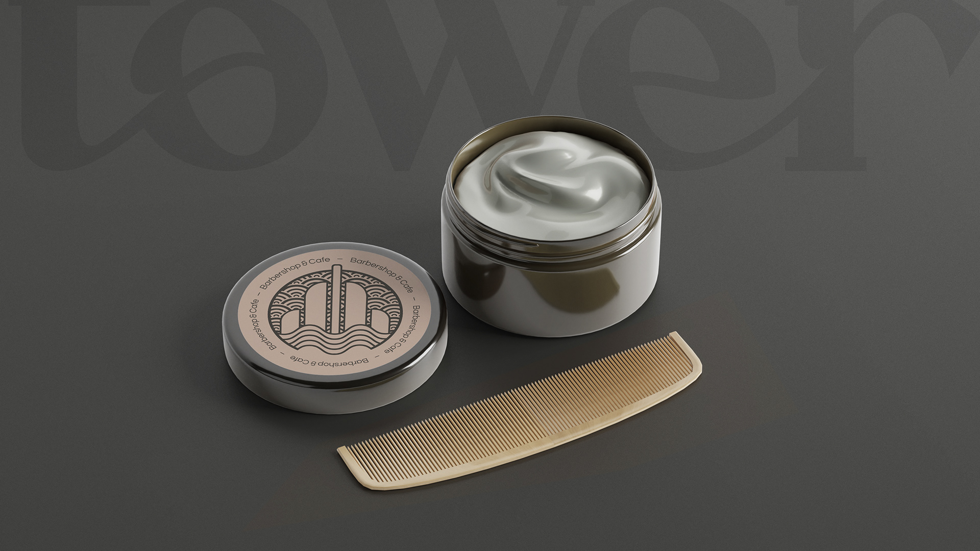
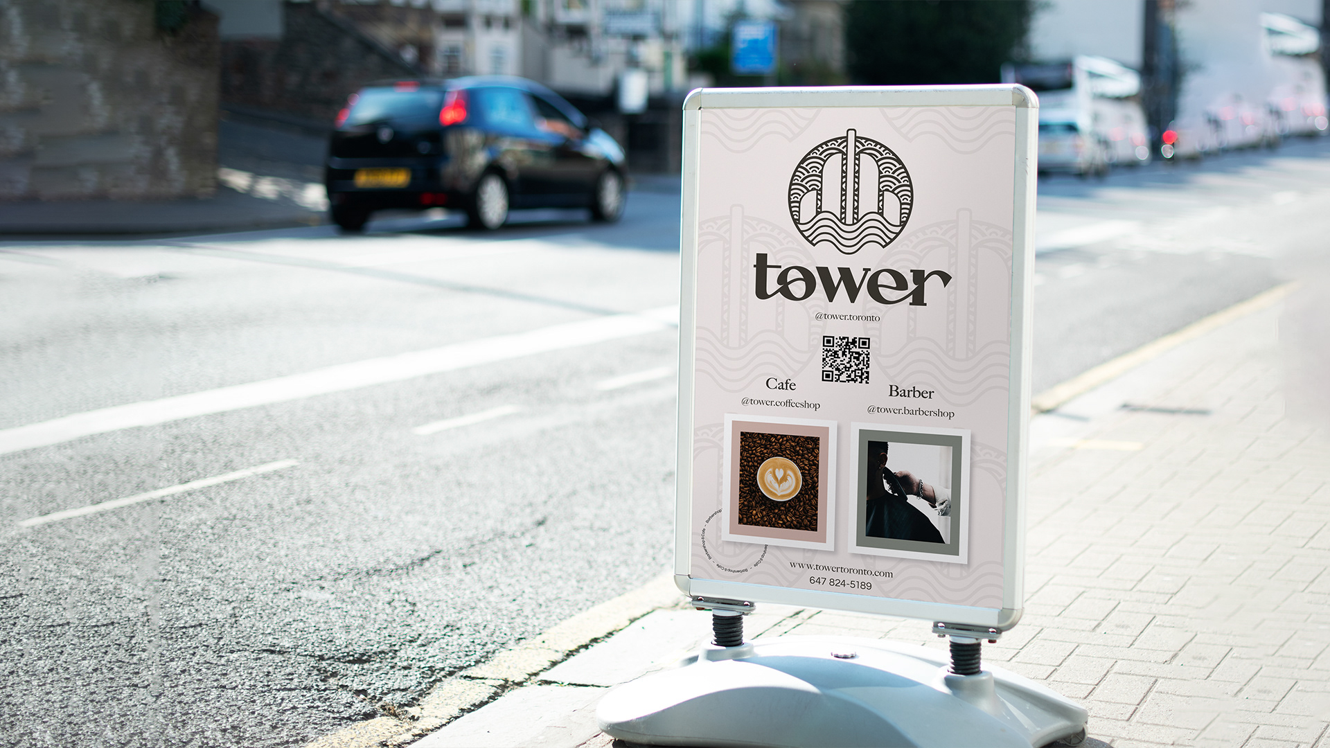
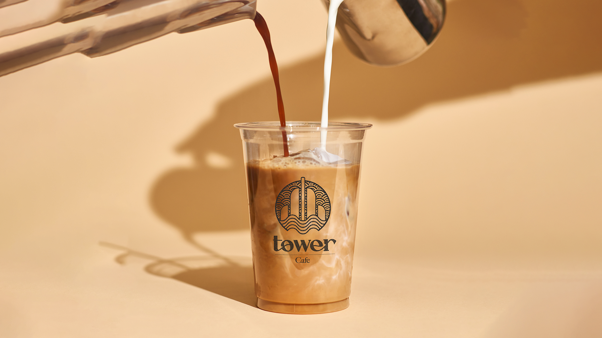
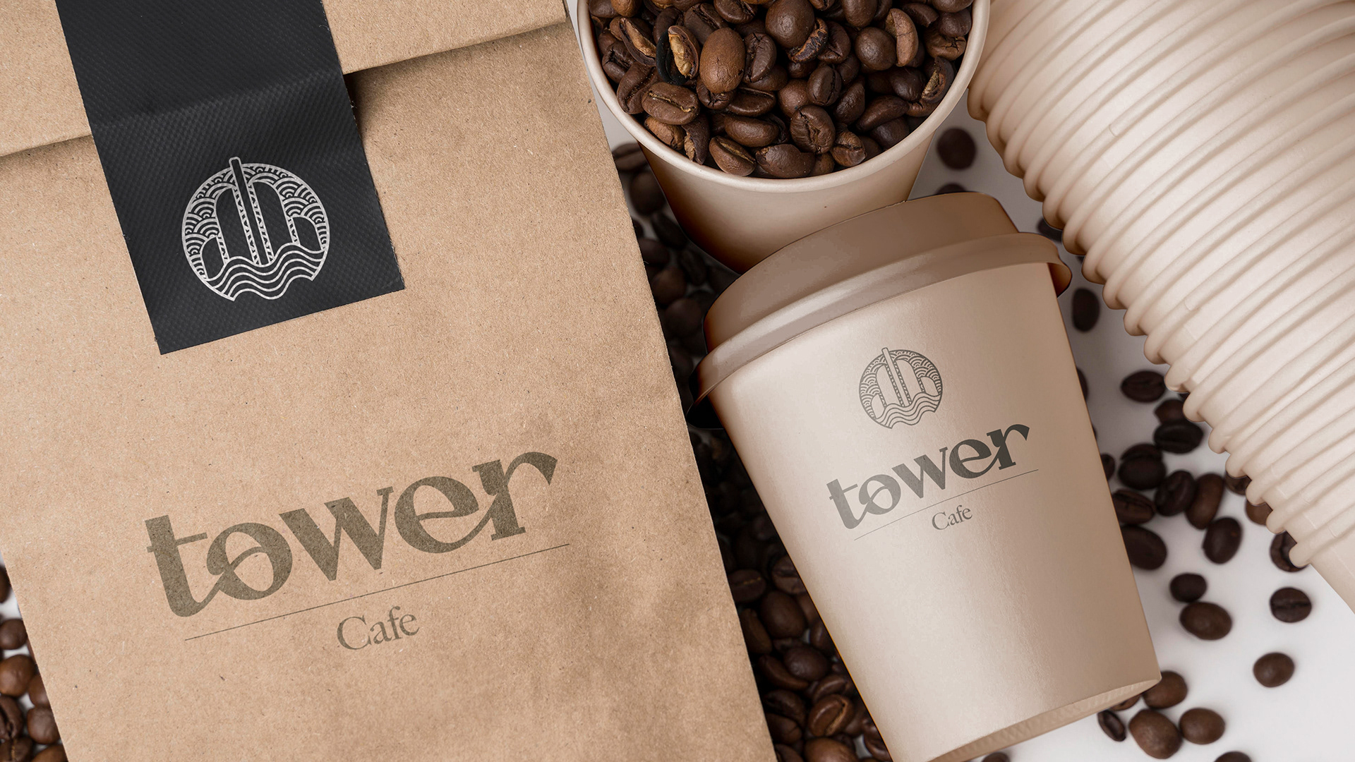
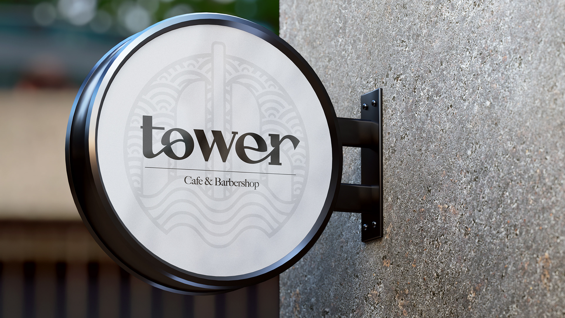
The result of our discovery session lead to a beautiful type mark of the brand name, Tower, and a logomark to support it. The logomark references to the city skyline of Toronto - the busy buildings, harbourfront, and the main, tall column representing the CN Tower, while staying away from the direct design of the tower - which felt very 'typical' to both parties in the process. The colour palette was specifically described by the owner as earth tones, which is where the off-white, beige, moss green and dark brown tones came from.
The Solution
After the initial discovery session, the branding project was to be completed at an expedited speed - just one week's time. We immediately got to work and presented the new identity as soon as all details were confirmed. The owner was ecstatic with the presentation, and felt that everything described leading up to the pitch, was executed perfectly. Next, it was time for print material, and photography to be implemented.
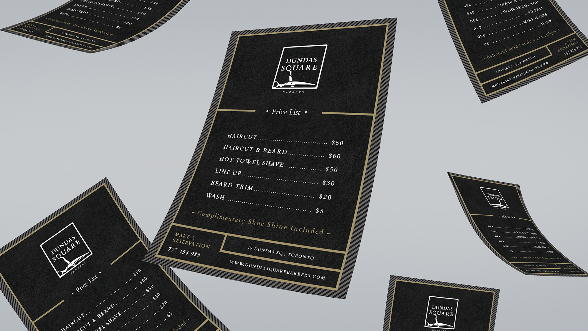
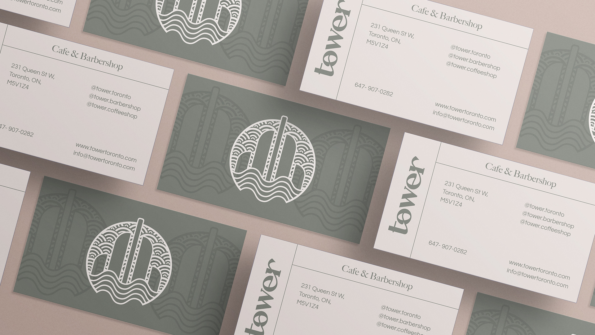
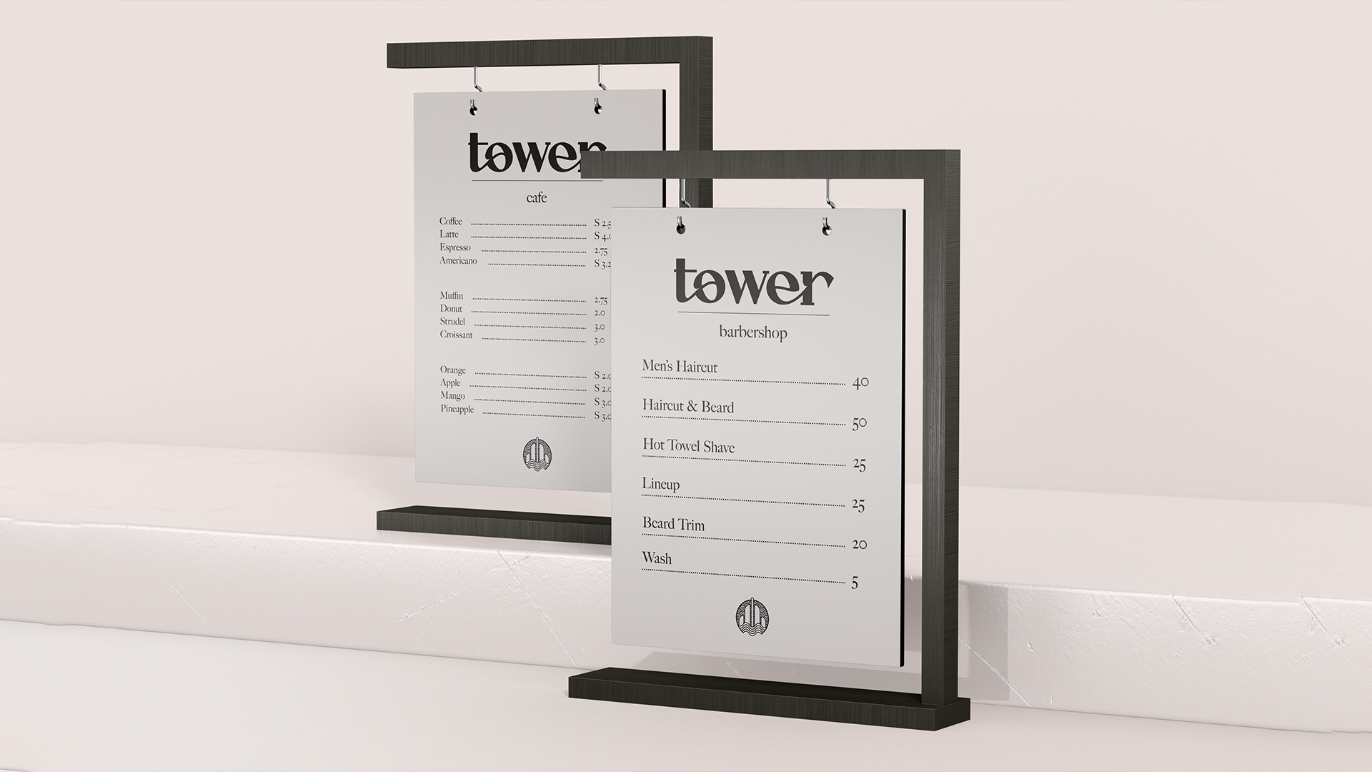
A focal point of the new business was it's high foot traffic, located on Queen Street West in Toronto, one of the busiest streets in the city. The print material must be high quality and catch the attention of passers-by. Everything was required from business cards, A-frame signs, menus, storefront signage, and products.
The following graphics are the exact designs recommended to the owner in support of the logo, and formats requested to make the brand-new barbershop and cafe into a successful business.

231 Queen Street West, Toronto, ON | www.towertoronto.ca | @towertoronto
Partnership; September 2021