The Problem
This woman-owned bakery and cafe built a following by creating custom-made cakes from their home, and are now moving into an official storefront. They needed a brand designed before their grand opening in Mississauga, Ontario. The owners wanted a strong brand and logo to create a memorable experience, building around their brand pillars of being women-owned and their Albanian-style treats. The brand must represent a modern, stylish environment that reminds customers of a European-style villa. The goal was to portray a modern brand perception with classical design elements.
The new brand identity must support the mood and tone of voice used throughout all channels including stationary print, social media, and website while creating a personality in the store.
The Process
This brand-new bakery and cafe desperately needed a brand designed before their grand opening. The owners wanted a unique and modern logo, one that would capture the target audience. The goal was to use design to accelerate performance in person and online and attract customers to the location which does not have heavy foot traffic to use to its advantage. After a discovery session with the owners, it was time to begin.
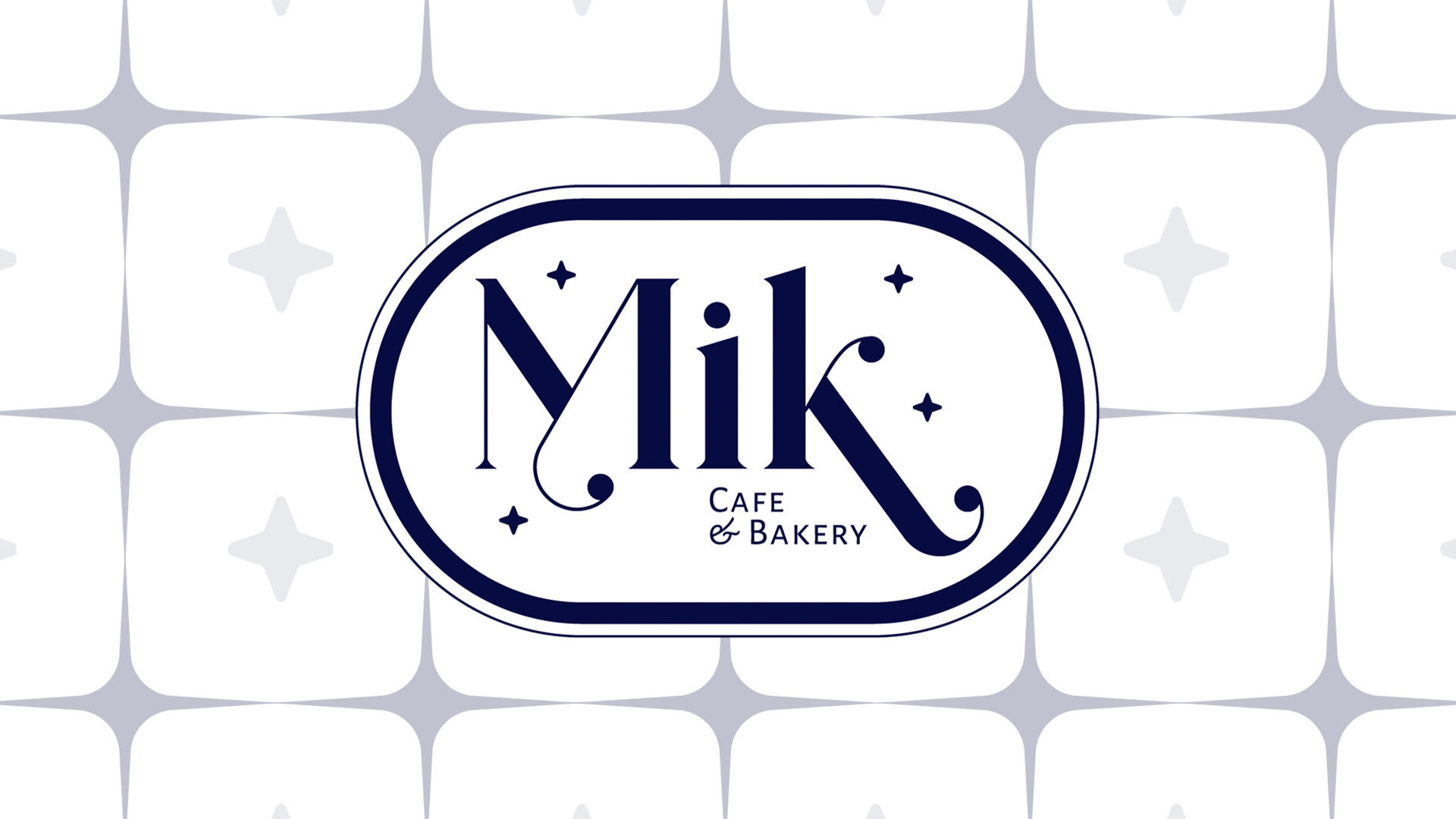
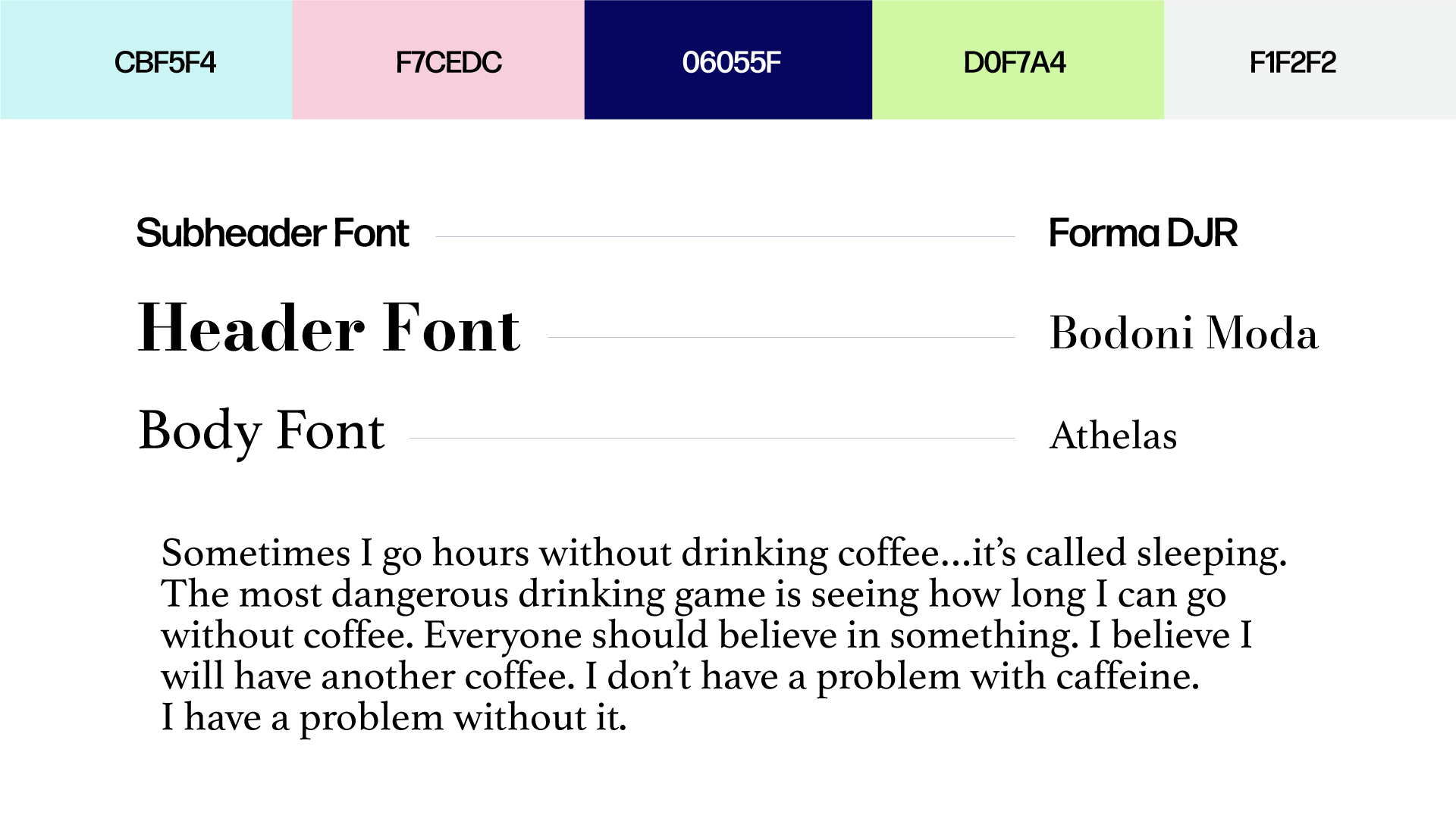
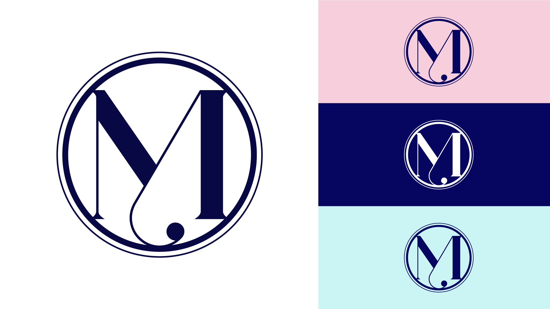
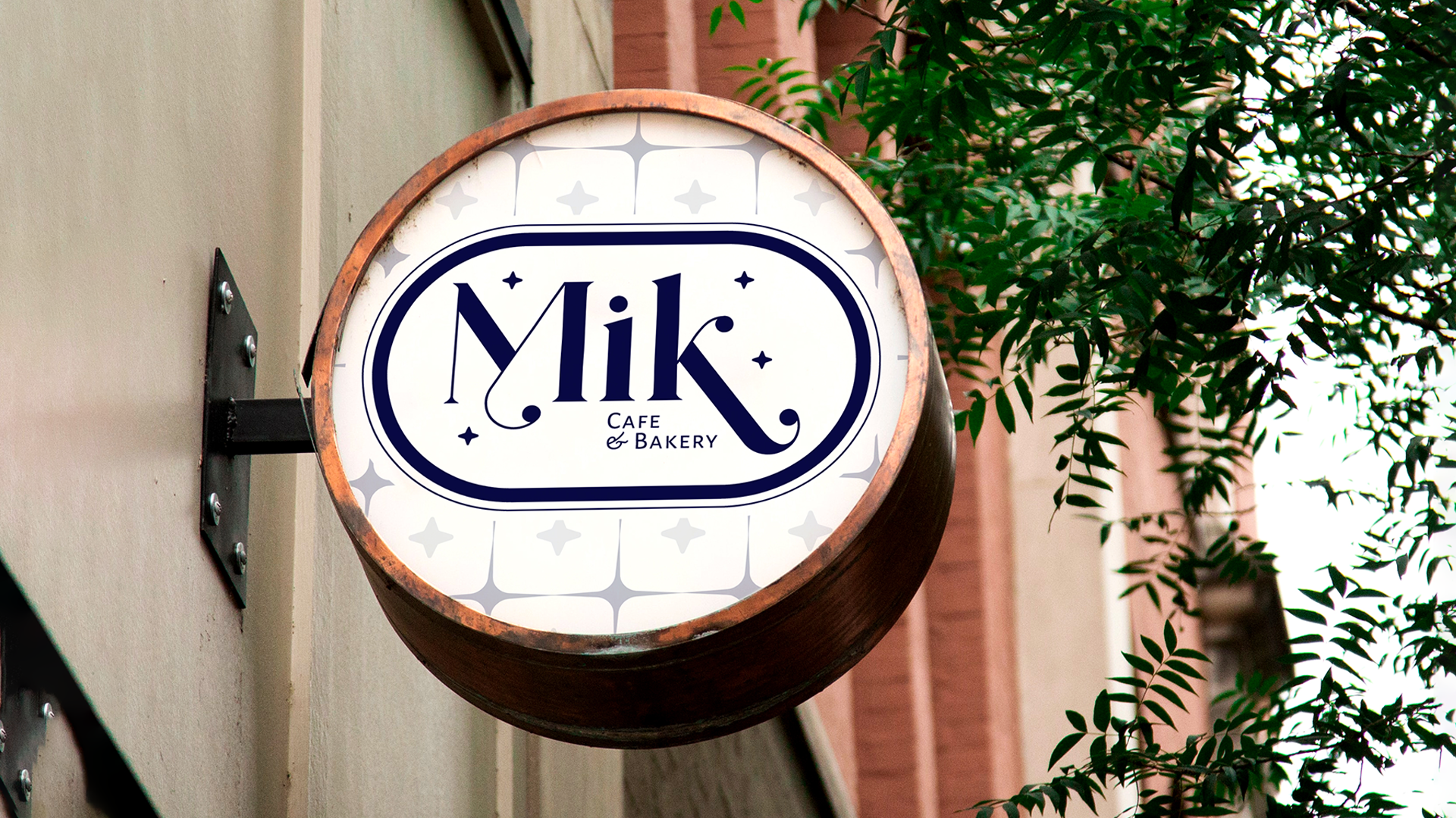
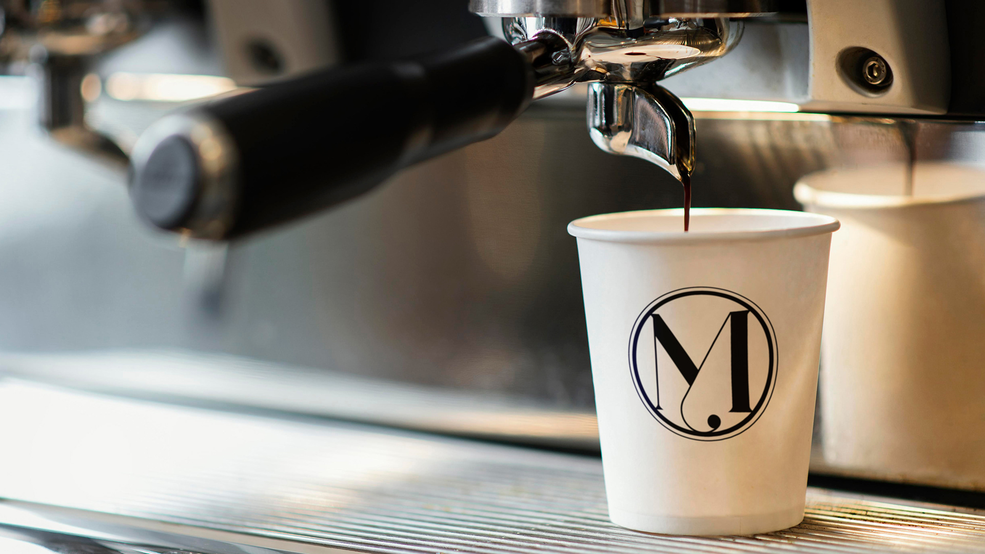
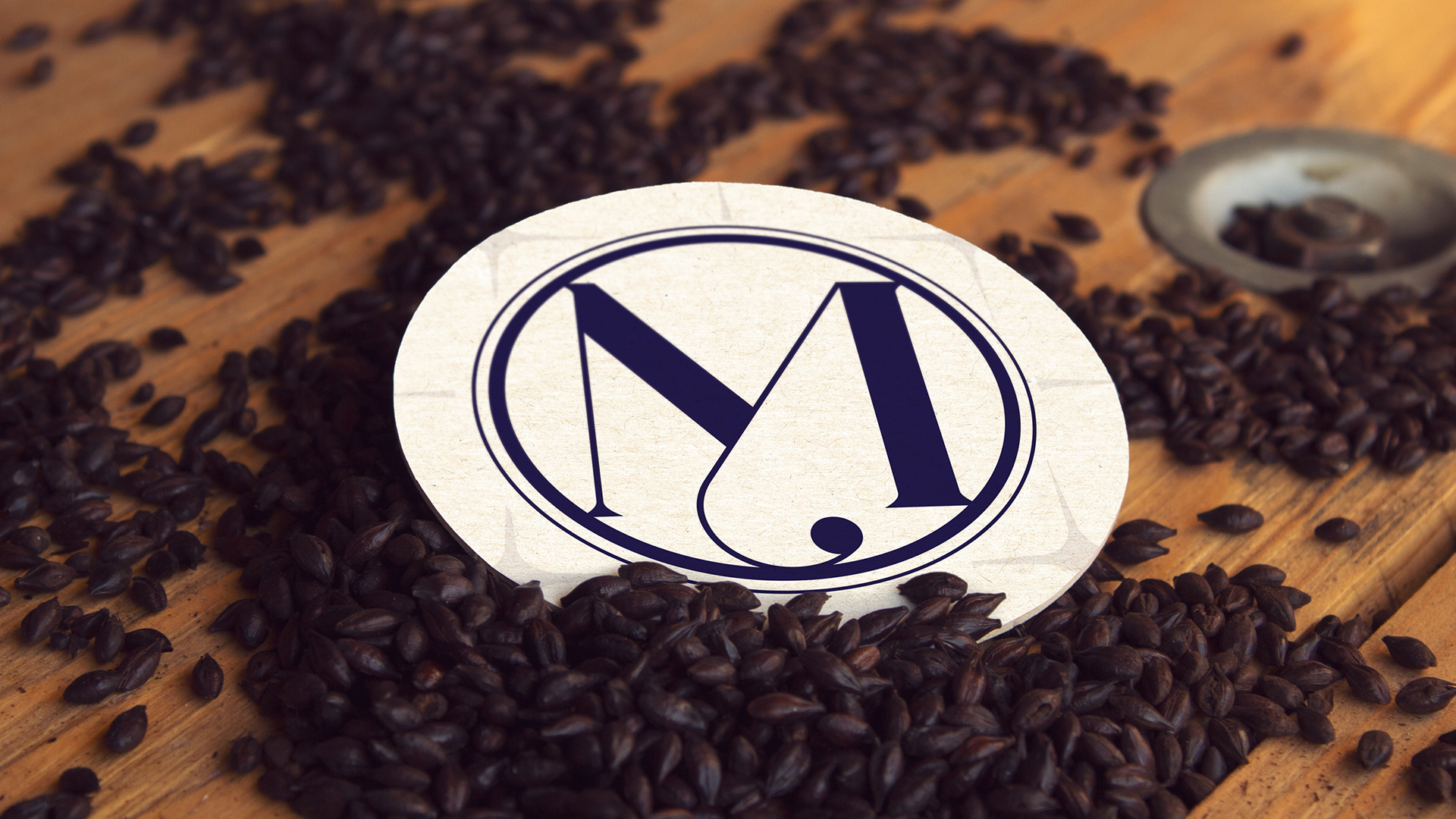
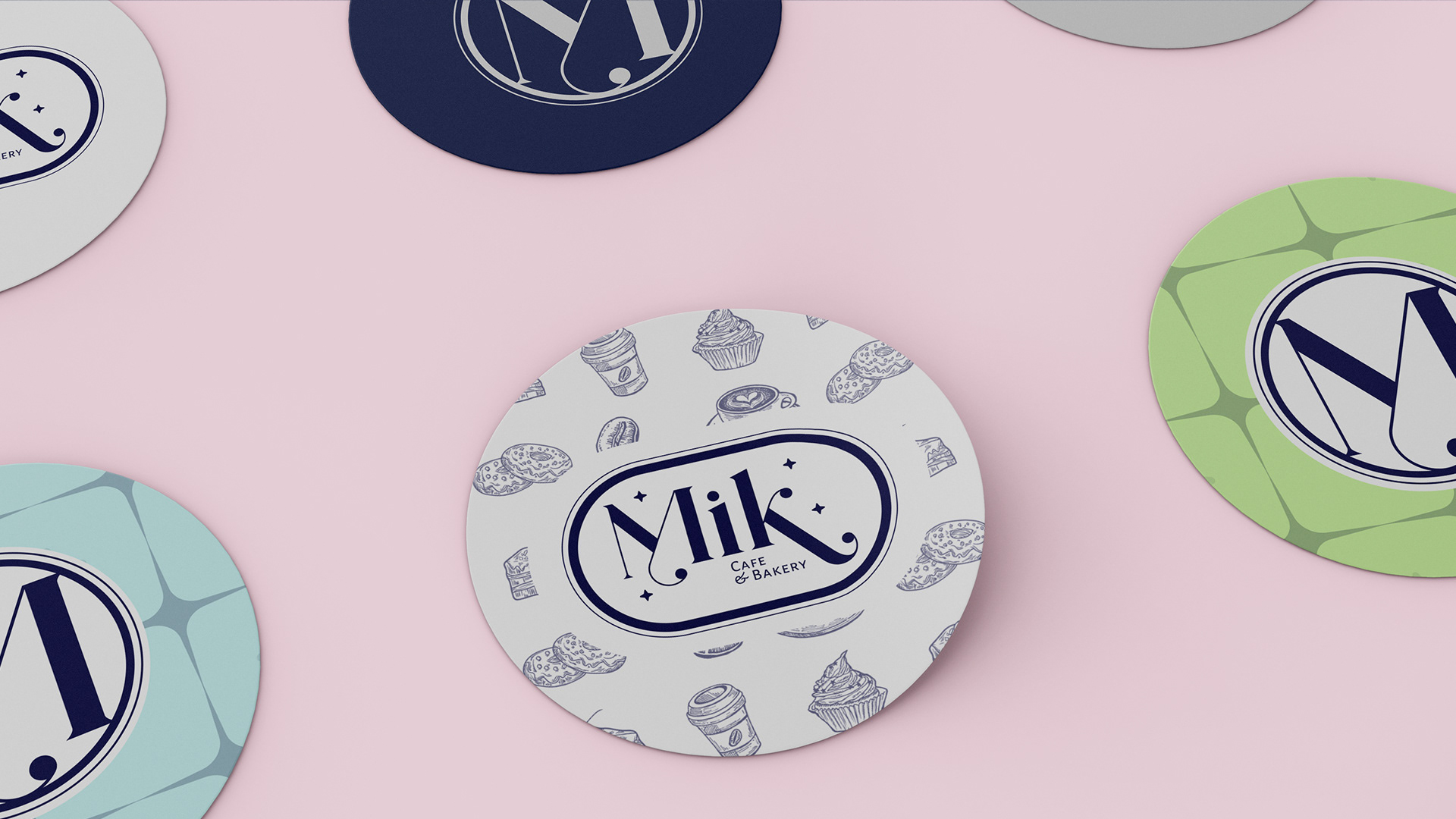
The main branding consists of a combination logo - a stamp-style text logo of the Albanian word 'Mik,' which represents someone you can trust, a companion who is dependable no matter what the situation. A logomark was also provided for small format print material, the serif 'M' that was used in the main logo. The colour palette was inspired by the female ownership and the initial discovery session that was used to gain the owner's perspective. The new brand identity must support the mood and tone of voice used throughout all channels including stationary print, social media, and website while creating a personality in the store.
The Solution
The owners were extremely satisfied when the brand presentation was released. They loved the logo and were beyond happy with the branding and colour palette so much that there were zero revisions to be made! The new cafe would require a number of services moving forward, including stationary print design for business cards, flyers, menus, storefront signage, and more. They also required high-quality photography and photo editing, which would then be implemented into digital marketing efforts. The digital marketing included Google MyBusiness profile optimization, social media marketing, and website development.
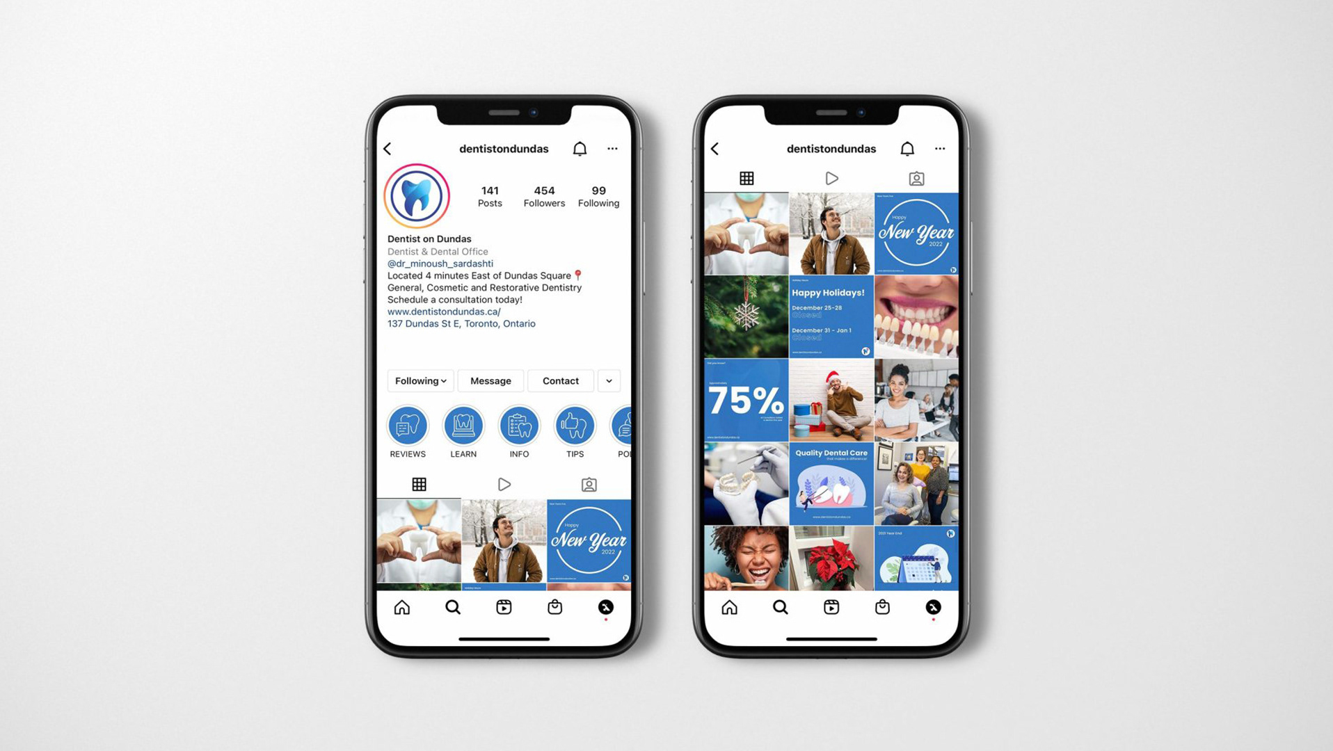
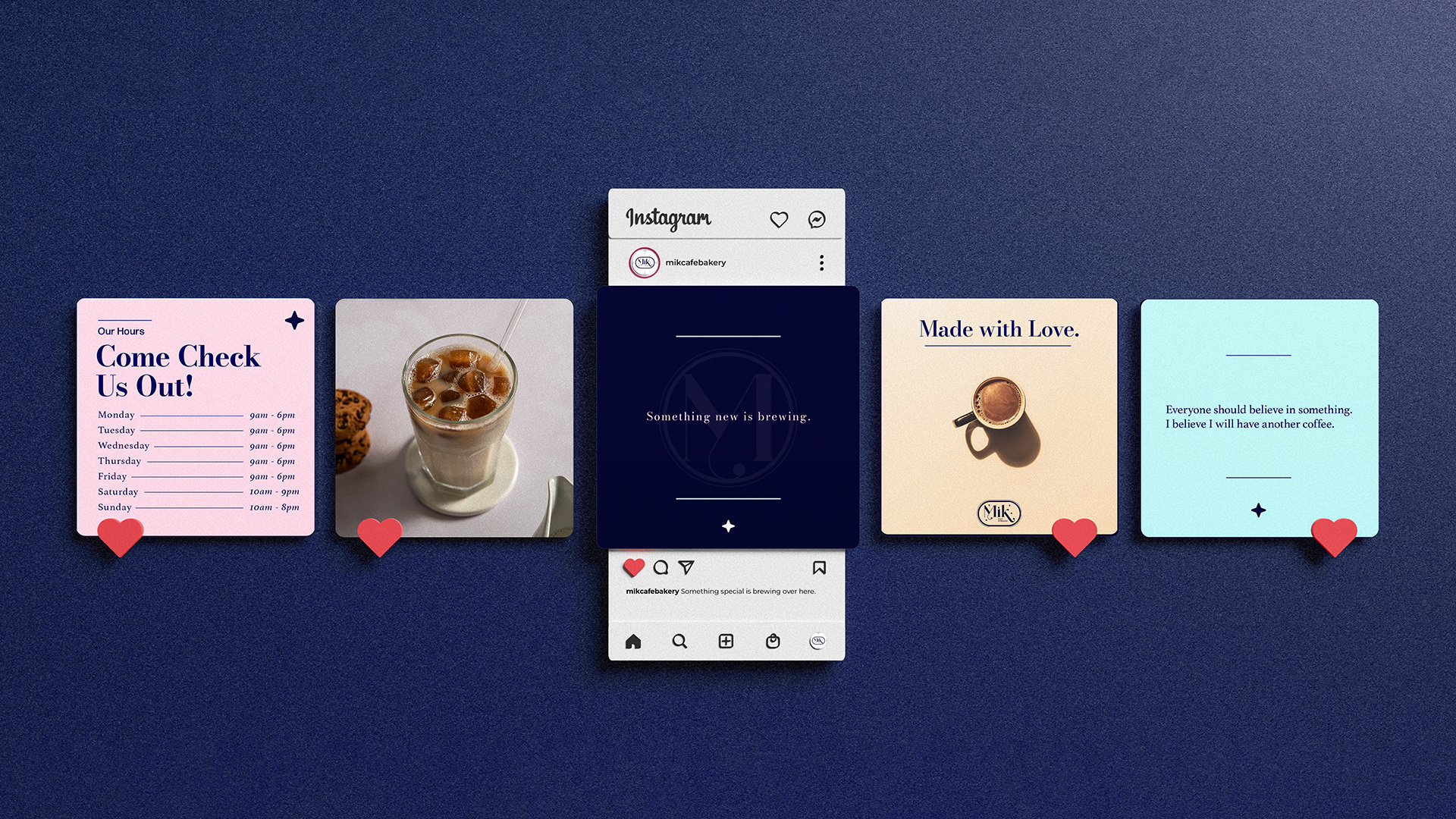
Rich social media content was vital to the campaign for Mik Cafe & Bakery. They already have a strong social media presence, however, the quality of the content was to be improved. A mix of graphic and photo content was provided for 2 months which would be managed by the internal team. Creating quality engagements, impressions, and using social media best practices to gain local attention was vital for the company's growth. As a result of these efforts, followers and engagements gained excellent traction.
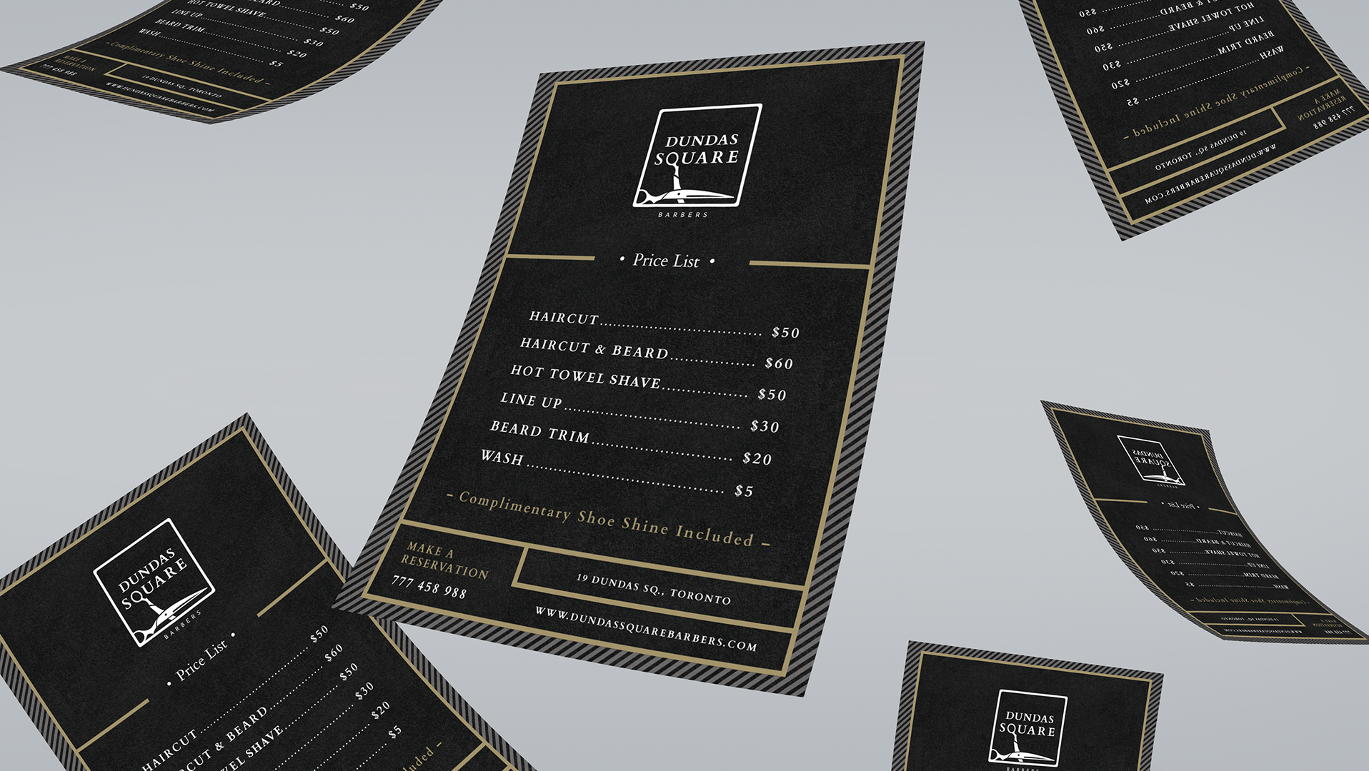
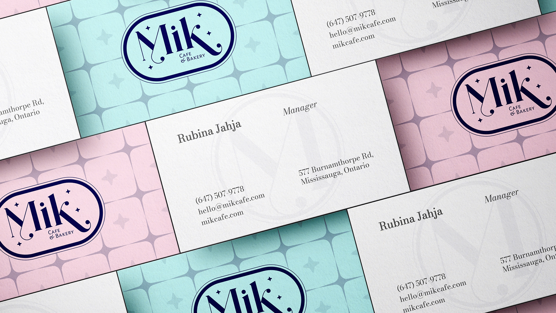
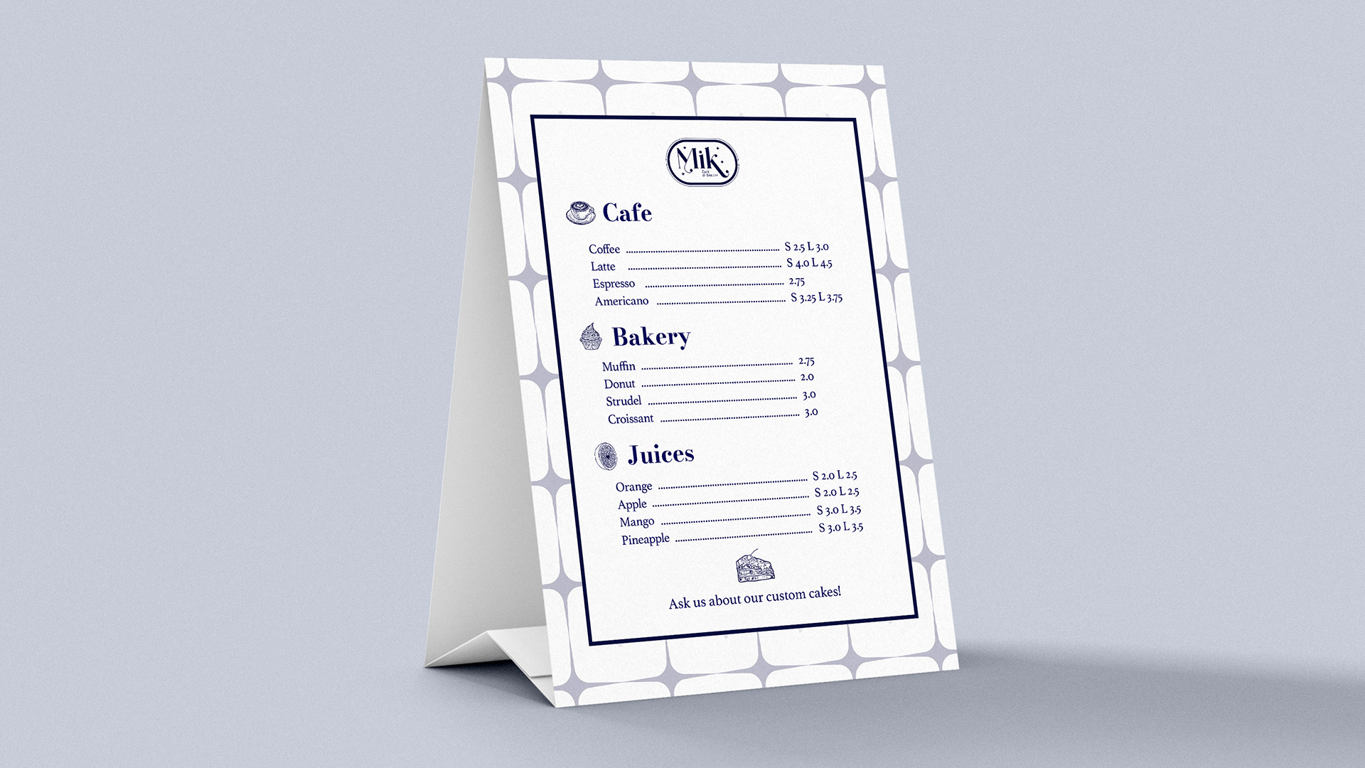
Quality print material is an important aspect of building a business and its' brand memorability. Therefore, stationary print such as business cards, letterheads, and other materials must be designed and sourced time-effectively and with quality in mind.
Professionally captured beautiful photos of the storefront, interior, and services were next. These stunning images are edited and polished, to enhance the Google MyBusiness profile, social media, and website. It is vital to use high-quality images for these channels for the user impression. Overall, a modern and friendly aesthetic user experience was provided to the new business.

577 Burnamthorpe St, Mississauga, ON | www.mikcafe.ca | @mik.cake
Partnership; September 2022 - Present