The Problem
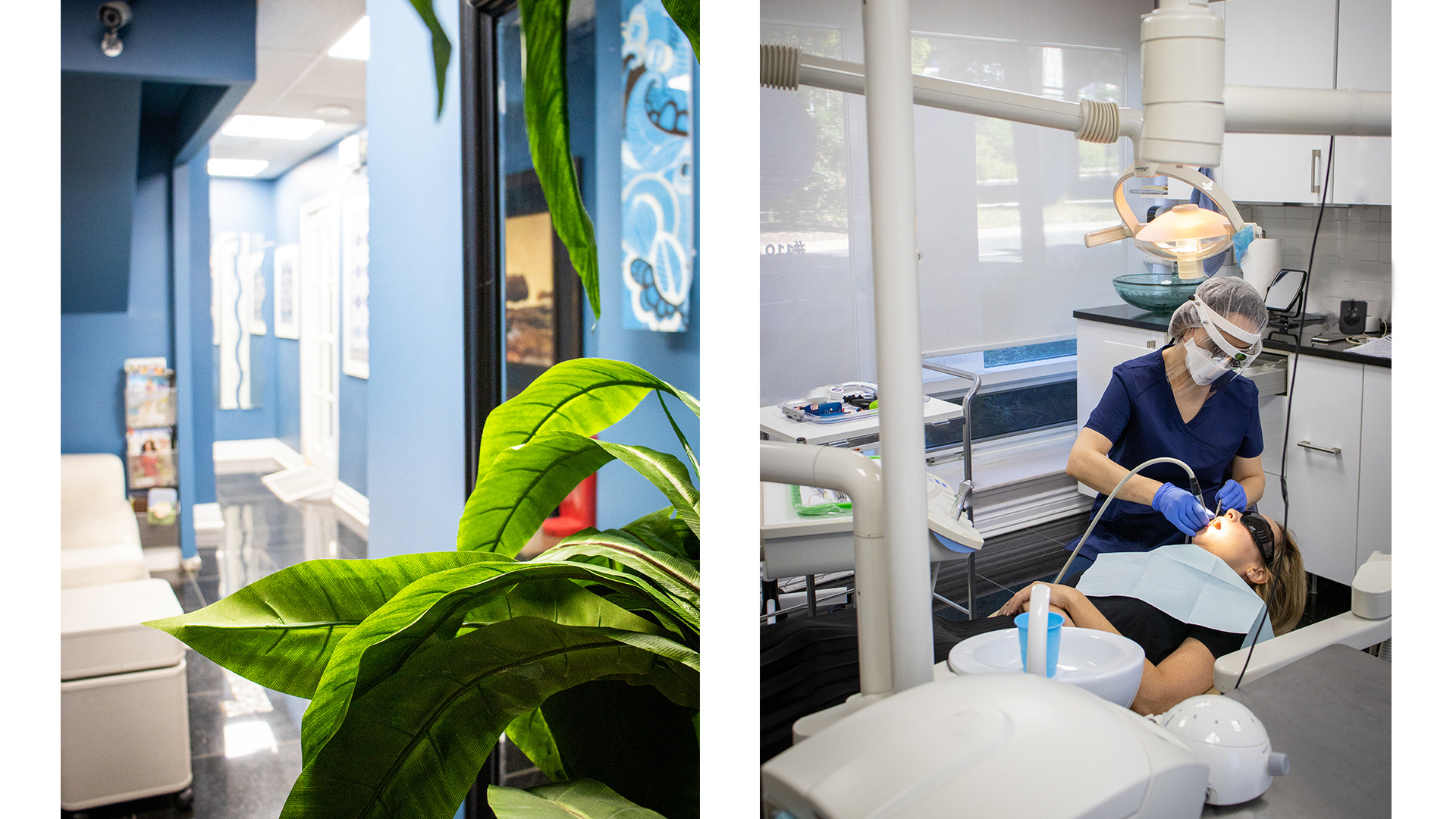
Dentist on Harbourfront was the second office purchased by the owner of Dentist on Dundas. Our successful partnership at the Dundas location put trust in the owner that a new office could be successfully opened along Queens Quay W, Toronto. The new office required a full 360 range of services from logo and branding, print design, strategic planning, social media marketing, content creation, photography, website development, and patient acquisition + communications.
As a brand new office, there was no brand, logo, or digital presence. In such a competitive landscape for dentists in Downtown Toronto, this was a vital aspect that could make-or-break the owners investment. Without a digital presence, it is nearly impossible for dentists to capture modern patients.
The Process
The new brand identity must support the mood and tone of voice used throughout all channels including stationary print, social media, and website while creating a personality in the store.
The process started with an initial discovery session with the owner. By asking them what they see for their brand, its future, and the keywords used to describe its personality, an excellent perspective on the brand's direction, was gained. From this meeting, the foundation of the brand was created.
The desired identity would represent a corporate and professional feeling, and as a healthcare service, this was imperative to the success of the new branding scheme.
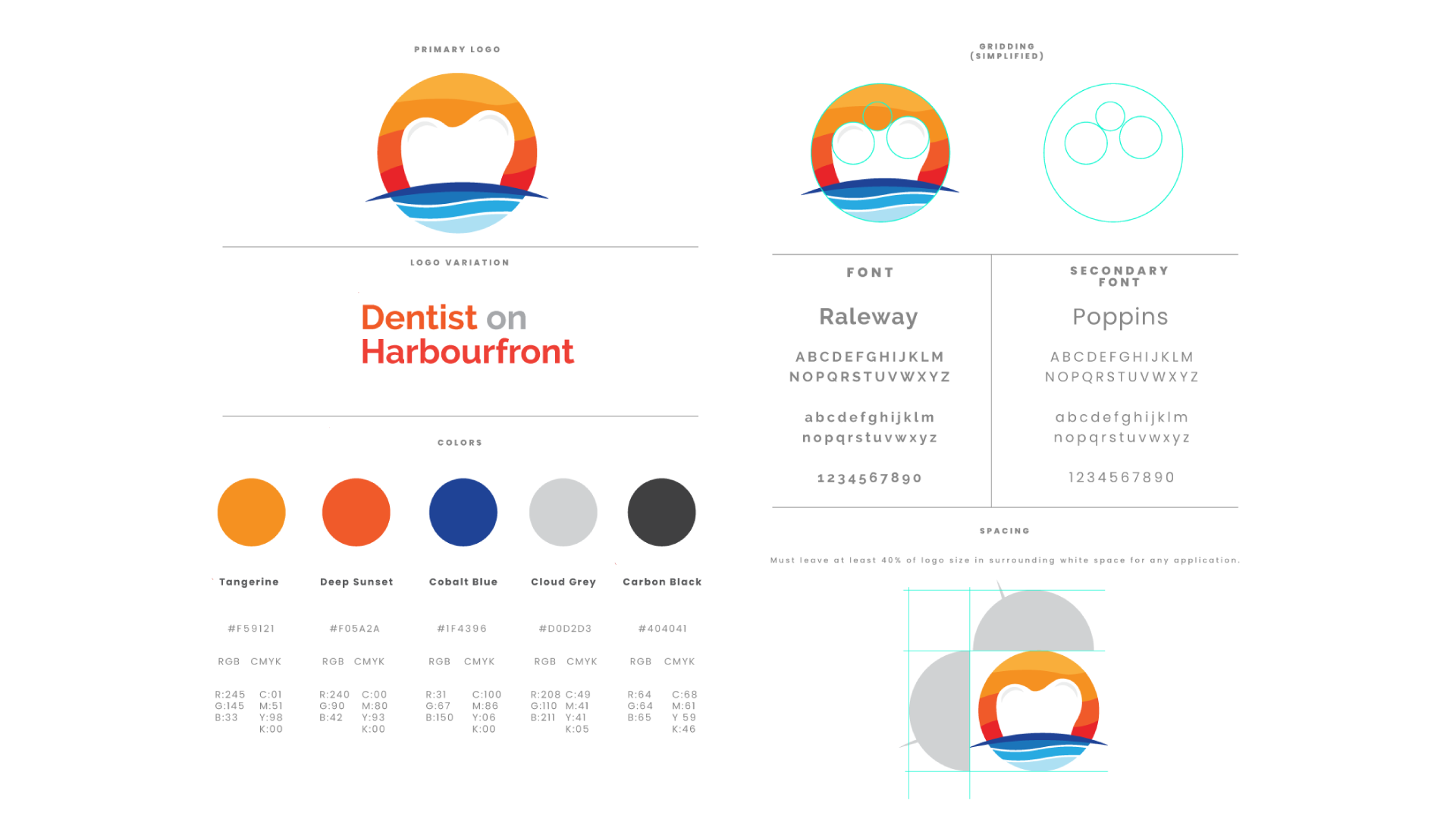
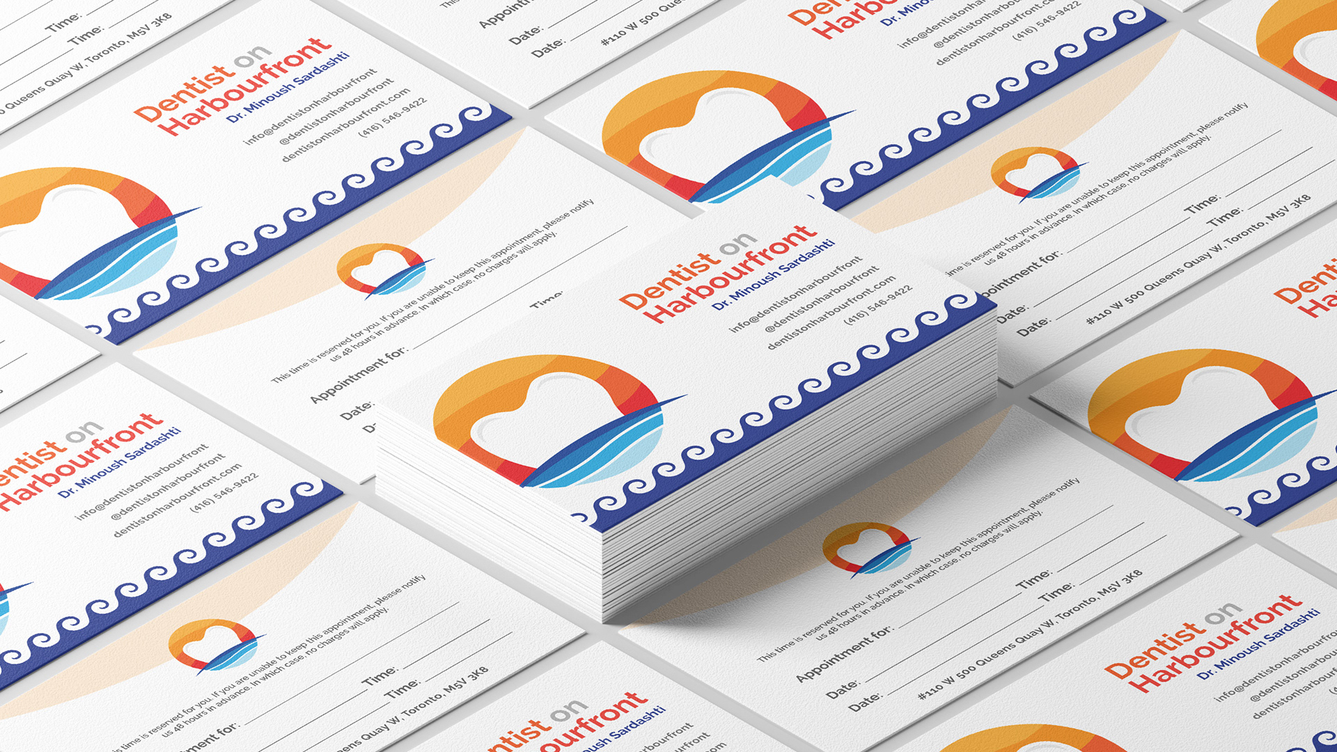
Full autonomy was given by the owner, which allowed for the brand to be taken in any direction that felt most appropriate. The surrounding harbourfront area is a sought-after area in Toronto, facing Lake Ontario with gorgeous gardens, waterfront boardwalks, boat docks, and beautiful sunsets. These elements of the office were incorporated into the logo, while maintaining the focal point of the business - a dentist office.
The colour scheme was referenced by the waterfront and incredible colours of the sunsets/sunrises that can be seen throughout the day from the office.

The Solution
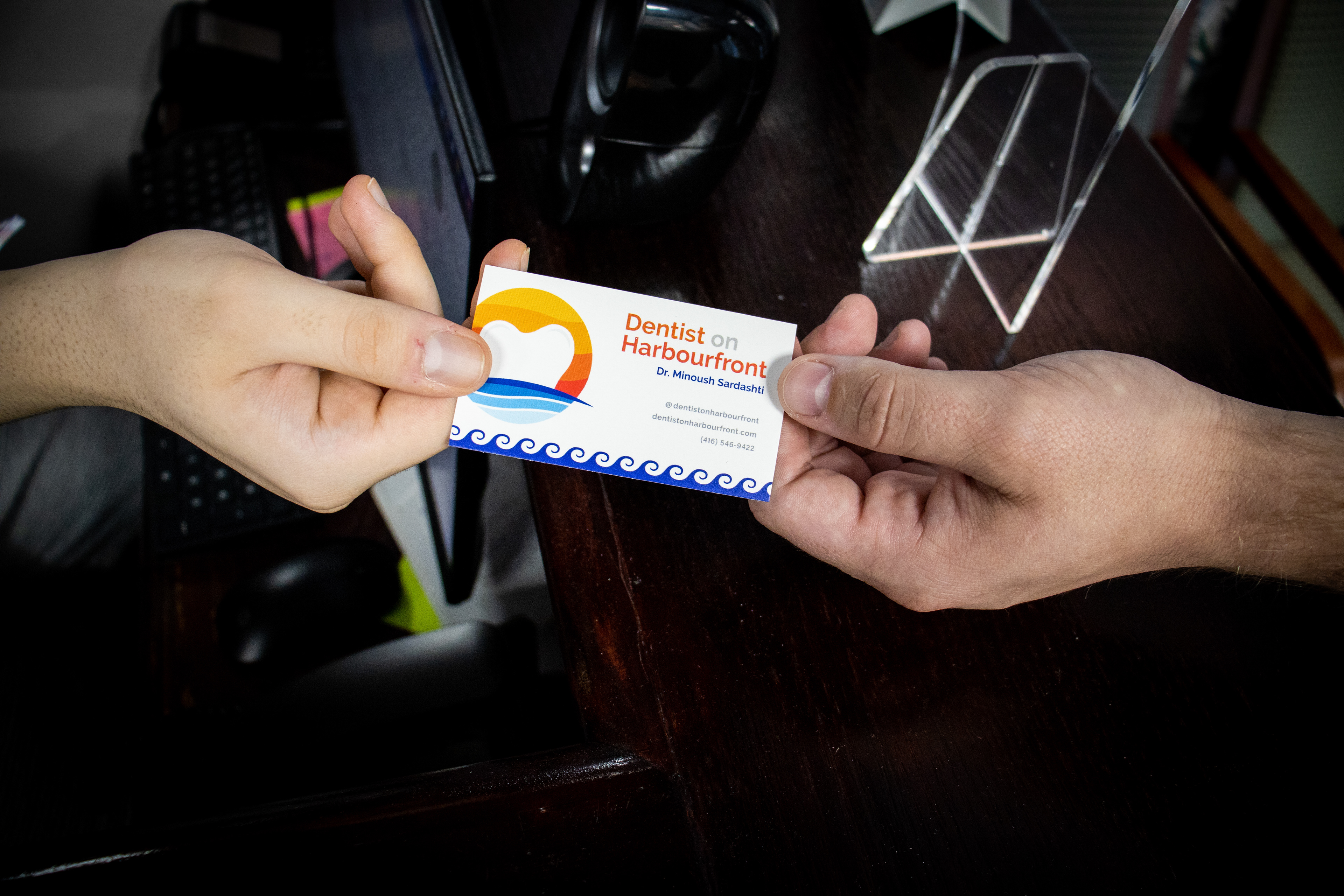
After a few weeks, the new identity was ready to present. The logomark was a modern concept of the tooth, with bold new colours and typography pairing. The owner was ecstatic with the presentation, and felt that everything described leading up to the pitch, was executed perfectly. Next, it was time for print material and photography to be implemented.
A focal point of the new business was creating a bold impression, located on Queens Quay W., Toronto, a busy street in the city's downtown core. The office also backs onto the off-ramp of the busy Gardiner Overpass - the orange window vinyl installations demands the attention of cars driving by. The print material must be high quality and catch the attention of passers-by. Everything was required from business cards, A-frame signs, menus, storefront signage, and products.
The social media, business cards, window graphics, sidewalk signs, flyers, were all coordinated and implemented based on the original presentation!


500 Queens Quay W. Unit #110, Toronto, ON | www.dentistonharbourfront.com | @dentistonharbourfront
Partnership; September 2020 - Present